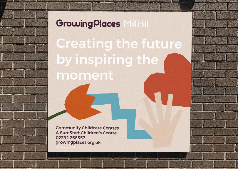
Creating the future by inspiring the moment.
The Reggio Emilia educational approach is an inspirational way of building a culture that respects childhood and allows each child to have daily opportunities to play, explore, discover, communicate and develop tolerant, understanding relationships. Bringing together, children, parents and staff in a journey of education.
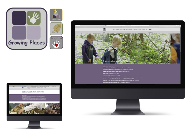
Original Branding
When we were briefed by Growing Places to rebrand them we took inspiration from their teaching philosophy and placed it at the heart of our visual approach.
The original branding needed a complete overhaul, not only from a design perspective but communication point of view.
We wanted to create a brand that felt fresh, energetic and exuded the way of teaching that Growing Places offered.
Adding the energy.
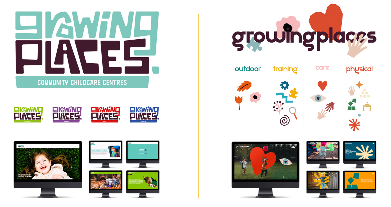
We presented two initial creative routes with the aim of making Growing Places look and feel like an exciting place to send your children.
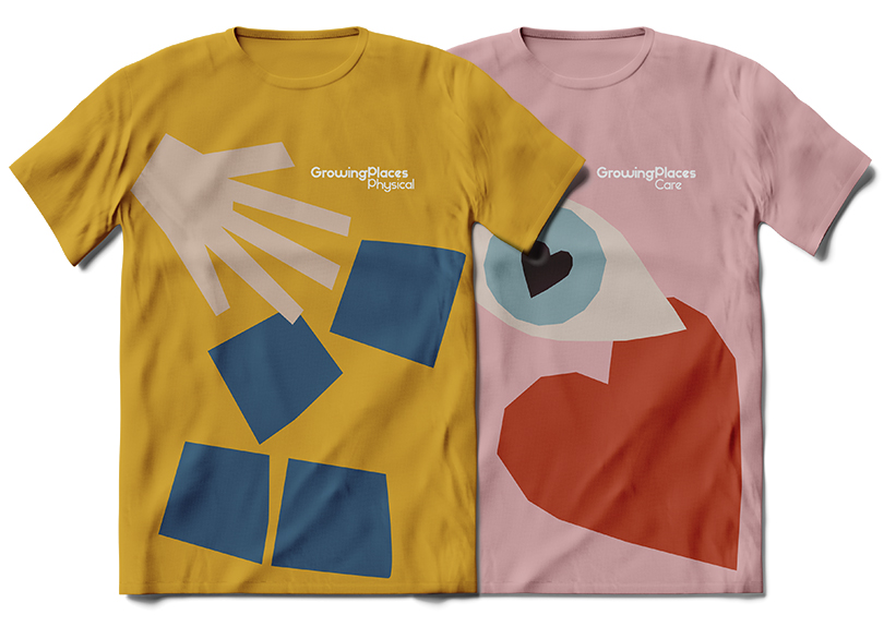
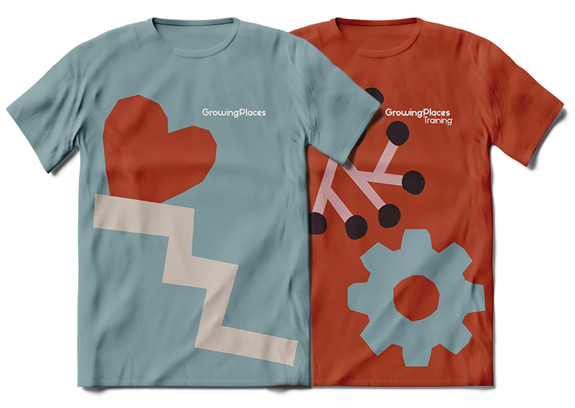
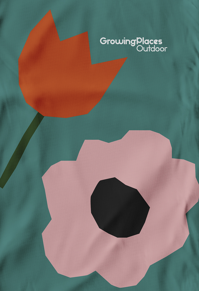
The route that was chosen utilised numerous hand crafted icons that allowed the design language to be free and place exploration at the centre of the the design.
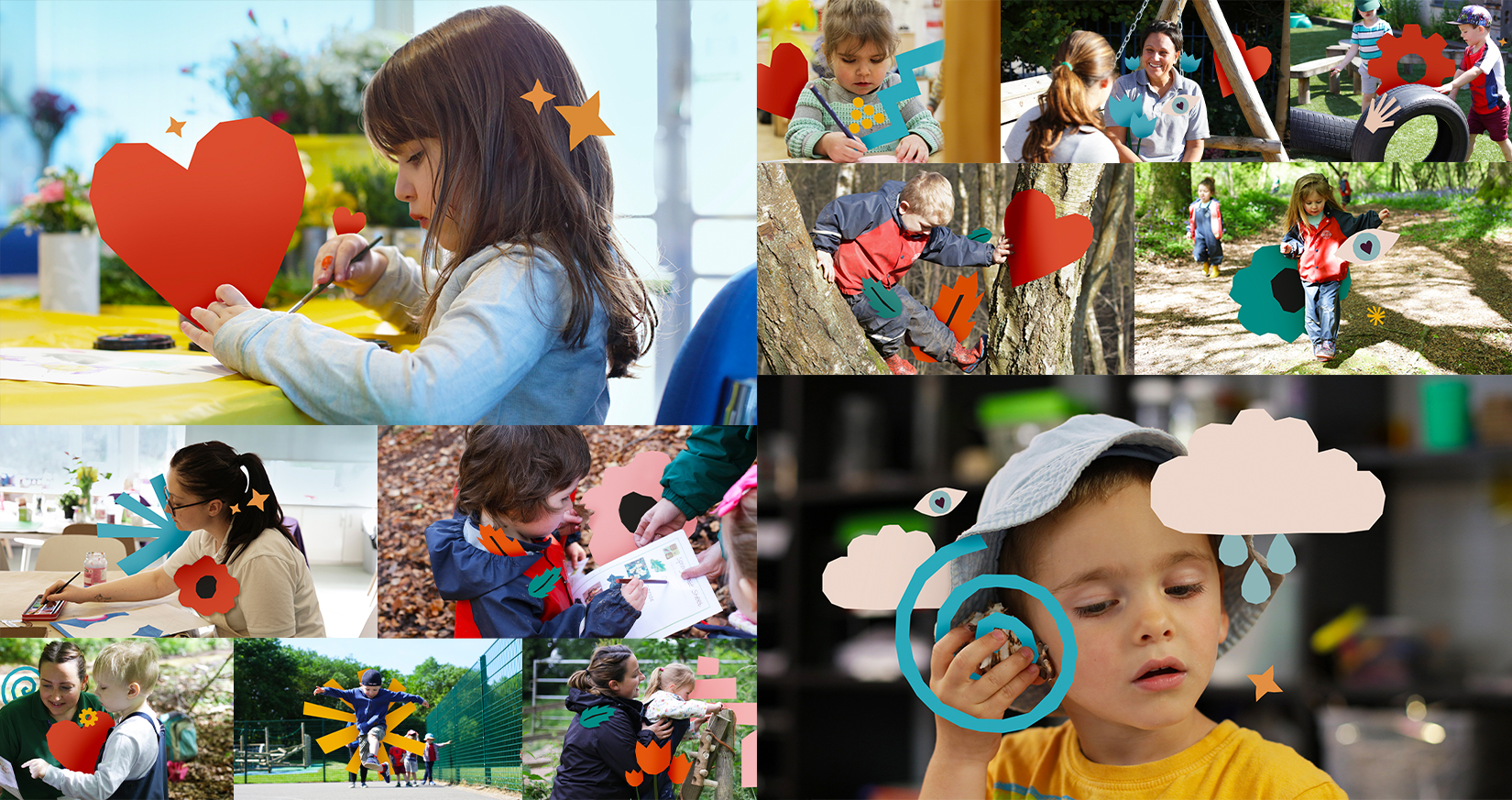
The design really came to life when placing the children, teachers and parents together in conjunction with the icons. These images would be used throughout the website and across social channels.
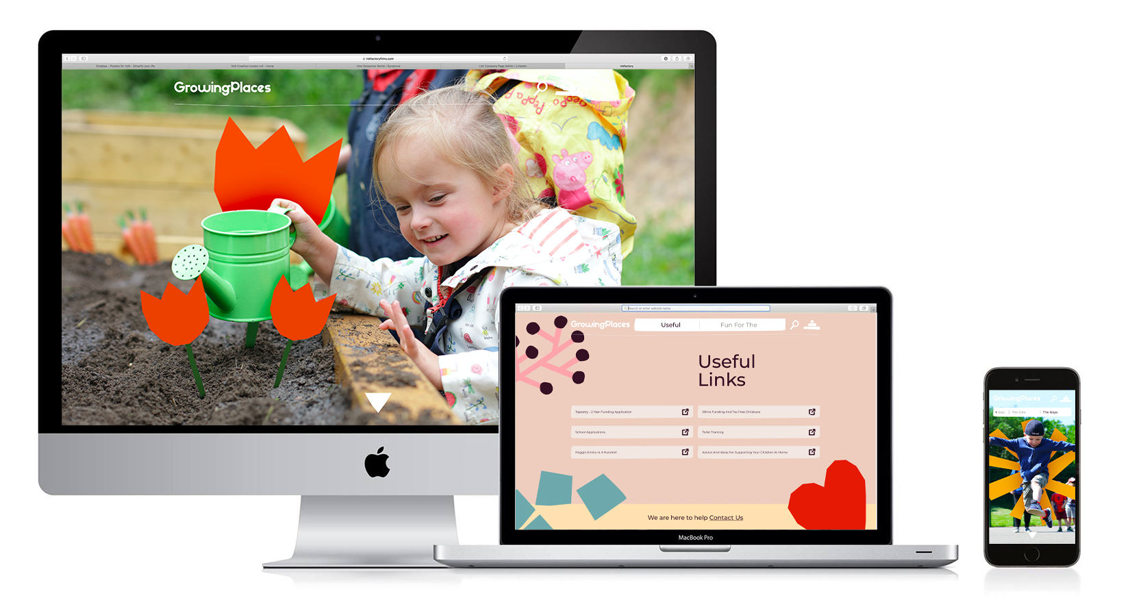
Moving Forward
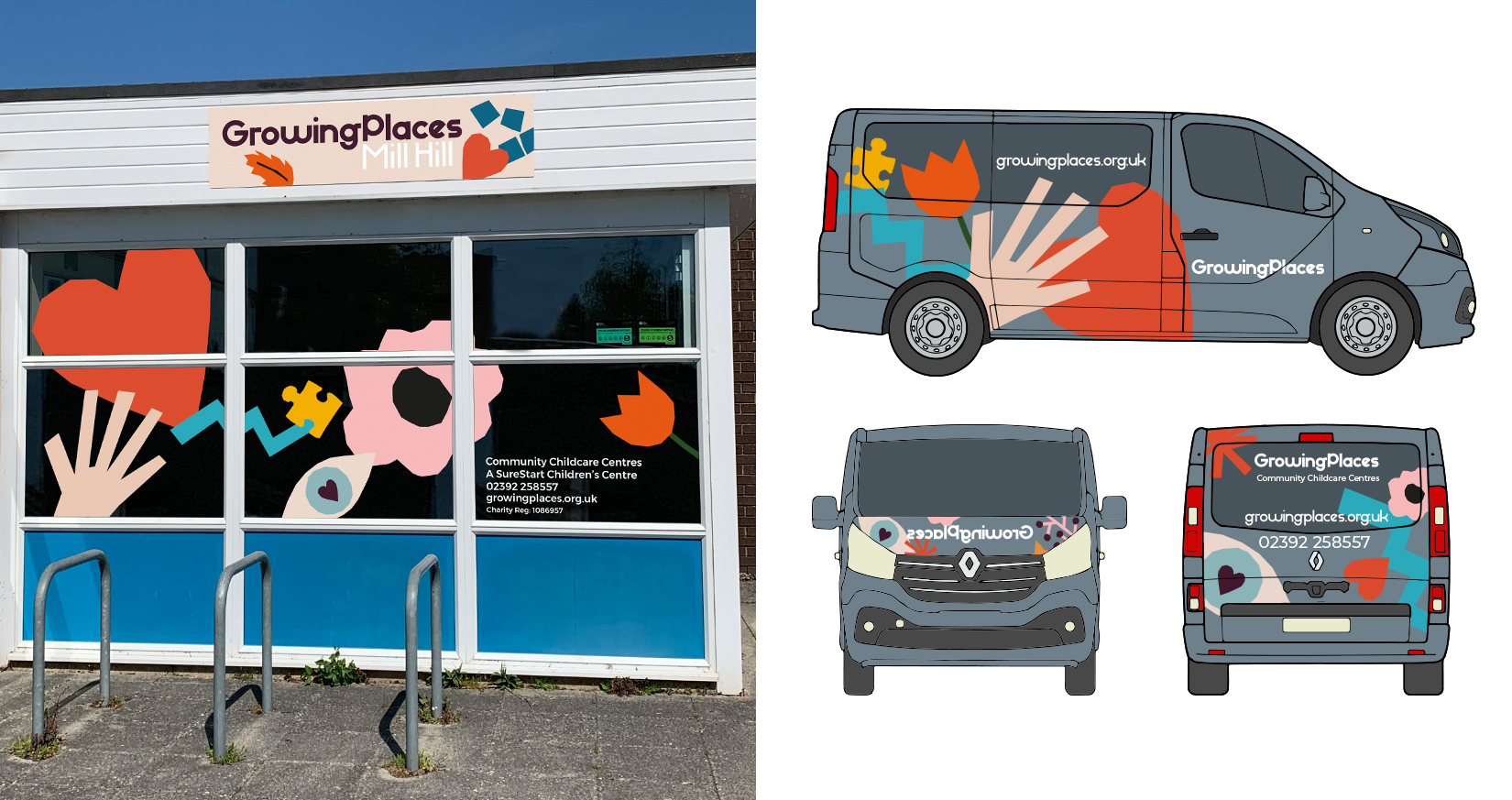
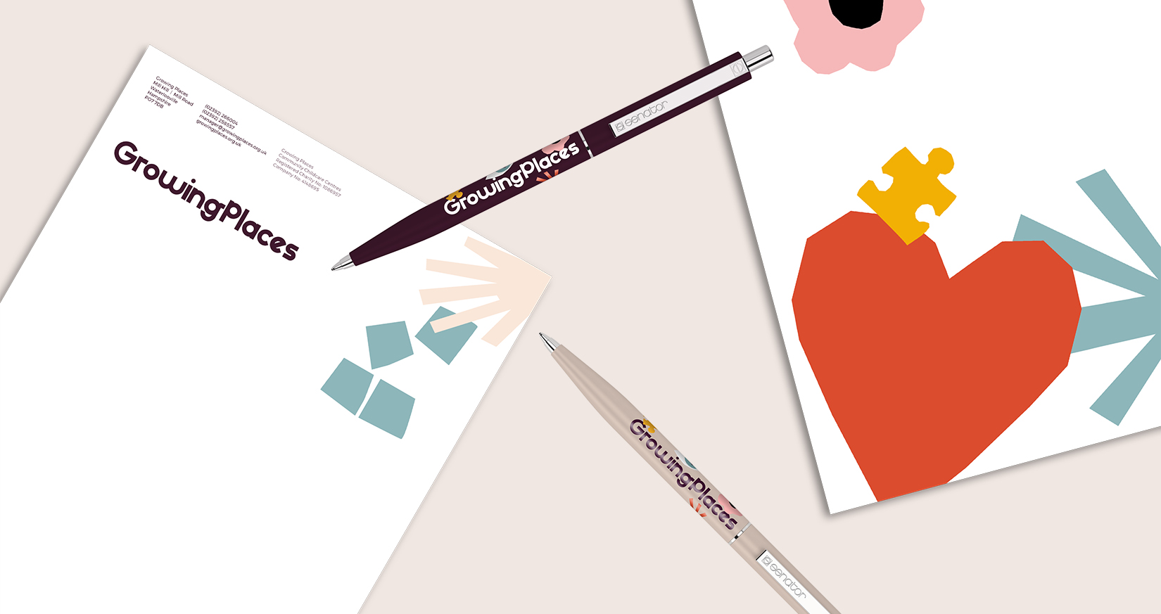
We designed a complete suit of assets that included location signage as well as the livery for Growing Places mini busses.
As the brand rolls out, the plan is to ensure that each location starts to embody the new branding by having the interior design cues such as on wall vinyls etc.
